
Interface Design For Restrooms
Sep 29, 2015
The basics of good interface design apply even to restroom design, and a poor interface leads to a confusing and frustrating user experience.
This new and mostly magnificent medical research building in Toronto has restrooms with a poor interface – their design and signage is confusing and frustrating.
As you walk along the hall you see the signs shown above, indicating that the restrooms are to the left. Making a left turn you are immediately confronted with the sign below:

Whoa... I'm looking for the men's restroom, and all I see is a sign for the ladies. Cautiously I take a peek around (you don't want to be too aggressive in searching what seems likely to be the ladies restroom) and see only this:
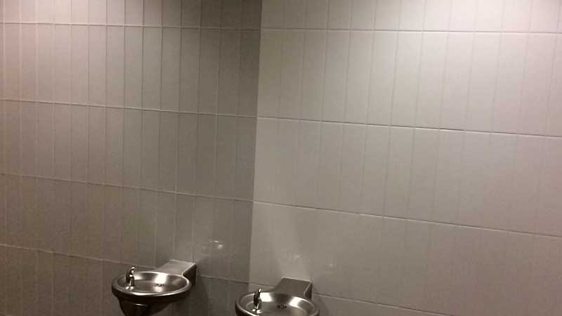
Now something seems really wrong. There is tiles on the wall and floor, and plumbing. That signals that you are now in a restroom, and the only sign visible suggests that it is the ladies restroom.
I'm in this building a few times a year and, every single time, I back out to the hallway and check the sign out there. Sure enough, it says there should be a men's restroom as well.
At that point I venture in a little deeper. And, sure enough, if you go in far enough, and look way over to the right, you will see this:
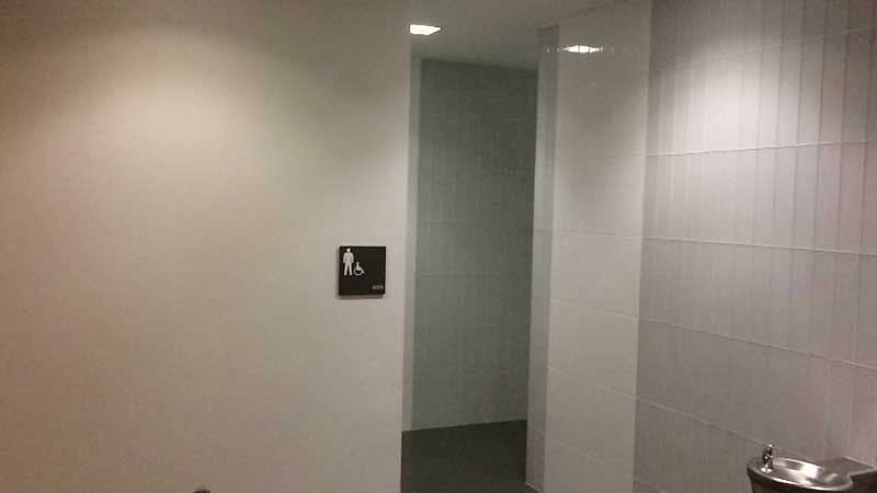
Way over at the opposite end of this little vestibule is a sign for the entrance to the men's room.
The problem is that the sign in the hallway promises access to different places – a men's room and a ladies room. A few more steps and visual clues – tiles on the walls and floor – suggest you are in a restroom, but the sign indicates it is the wrong one.
To get where you want to go you have to ignore all that, and keep pressing on. Only if you proceed on blind faith will so get to the other restroom.
One solution would be to present the user with signs for both the mens and ladies restrooms, with arrows for each (please excuse the very crude mockup):

Add arrows and the user gets good feedback, and they can go about their task confidently.
Alternatively, and more symmetrically, both signs (along with arrows) in the center of the restroom vestibule like this (please excuse another crude mockup):

This puts everything on an equal footing – everyone has to proceed to the same point, where they get the information they need: men go to the left and women go to the right.
Another Example Of User Interaction
The videos below show how users tend to struggle with this design when coming from the other direction.
Interface Design For Restrooms 1 from Mark Anderson on Vimeo.
Interface Design For Restrooms 2 from Mark Anderson on Vimeo.
Related Content
More Great Parking In Toronto
Bad Design Creates Terrible Experience At Great Restaurant
Old Storefront Unearthed During Renovations At 2025 Yonge
Falling Out Of Love With The Toronto International Film Festival
Museum Subway Station Toronto
Better Drag & Drop Sorting For FileMaker
Discoverability: If It Isn't Found It Isn't There
Atrocious Street Parking In Toronto
Multiple Paths to the Same Place
SOFA – Very Lucky To Be A Part Of It
Category List
Tag List
Deceptive Order Gathering (10)
Concrete5 (1)
Conventions, Conferences & Trade Shows (4)
Floral Industry (4)
Website Development (17)
Online Marketing For Florists (50)
SugarCRM (3)
Mac OS X Server (11)
Flower Buying Tips (23)
Bitcoin (3)
Website Cache – Prime & Load (5)
Mac OS X (5)
Digital Security 2014 (10)
Google Authenticator (5)
SAF (Society of American Florists) (5)
Floral Management Magazine (14)
Examples of Florist Creativity (6)
FileMaker (18)
Two-Factor Authentication (5)
Arduino (7)
Shop Local (12)
Interface Design (7)
Industrial Design (2)
Multi-Factor Authentication (5)
Security (33)
Floral Associations (27)
Support Main Street (12)
Pricing (19)
Toronto (11)
Influence & Persuasion (12)
Technology (1)
Litecoin (3)
Best Practices (32)
Graphic Design (4)